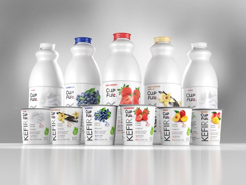
Babylon Garden napoje kokosowe
Dla marki Babylon Garden, opracowaliśmy kolejny (wcześniej Basil Drinks) kompleksowy projekt etykiet dla nowej linii napojów kokosowych. Linia została przygotowana z myślą o rynku skandynawskim, gdzie szczególną wagę przykłada się do estetyki, przejrzystości informacji i naturalnego wizerunku produktu.
Naszym zadaniem było stworzenie projektów, które w atrakcyjny sposób oddadzą tropikalny charakter napojów. Postawiliśmy na minimalistyczną, ale apetyczną formę – dominującą rolę odgrywają realistyczne ilustracje kokosa oraz dodatków smakowych, takich jak ananas, truskawka, banan, mango czy czekolada. Elementy graficzne umieszczone są na tle subtelnie mlecznym, nawiązującym do konsystencji i delikatności napoju kokosowego.
Etykiety zostały tak zaprojektowane, by współgrać z przezroczystą szklaną butelką i kolorem samego napoju. Dzięki temu opakowanie prezentuje się świeżo i naturalnie, a cała seria zachowuje wizualną spójność.
Projekt łączy walory użytkowe z atrakcyjnością wizualną – spełnia wymagania rynku detalicznego, jednocześnie wyróżniając się estetyką i spójnością. Seria etykiet dla Babylon Garden to przykład przemyślanego designu, który wspiera wizerunek marki jako nowoczesnej, egzotycznej i otwartej na różnorodne rynki.
To kolejna udana realizacja, potwierdzająca, że dobry design potrafi nie tylko przyciągać wzrok, ale i budować wartość produktu.
Klient: Sedir Food AB
For the Babylon Garden brand, we developed another comprehensive label design project (following our previous work on Basil Drinks), this time for a new line of coconut beverages. The line was created with the Scandinavian market in mind, where aesthetics, clarity of information, and a natural product image are especially valued.
Our task was to design labels that would capture the tropical character of the drinks in an appealing way. We opted for a minimalist yet appetizing style — with realistic illustrations of coconuts and flavor additions such as pineapple, strawberry, banana, mango, and chocolate. Graphic elements are placed against a soft, milky background, reflecting the creamy texture and delicacy of the coconut drink.
The labels were designed to harmonize with the transparent glass bottle and the natural color of the beverage itself. As a result, the packaging appears fresh and natural, while the whole product line maintains visual consistency.
The project combines functional clarity with visual appeal — meeting the expectations of the retail market while standing out through refined aesthetics and a cohesive design language. The label series for Babylon Garden is a great example of thoughtful design that supports the brand’s identity as modern, exotic, and open to diverse markets.
This is another successful collaboration that proves good design can do more than catch the eye — it can enhance a product’s value.
Client: Sedir Food AB
Podobne realizacje / Similar implementations:
Information
Category:
Food
Date:
23 May 2025